Overview
This market analysis examines the performance of U.S. financial markets since the 2007-2008 Financial Crisis, delving into asset relationships in an attempt to identify risks lurking just below the surface. This report relies heavily on relative valuation to coax the hidden messages into the open. Keep your eye on the ball and don’t become distracted as it’s the activity (not rhetoric) emanating from the Fed and other major central banks that shall determine what happens next.
A Quick Review
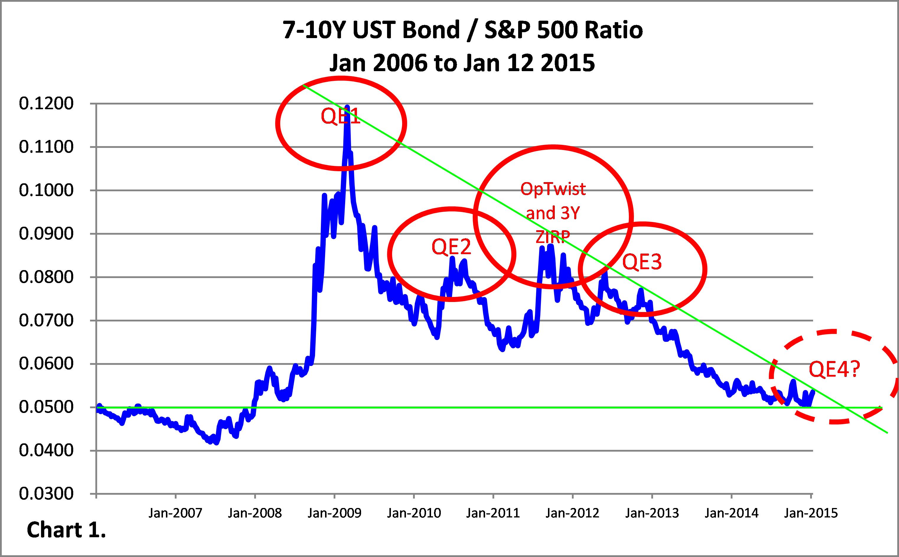
The market anticipates Fed monetary actions to get a jump on investing. As the 2007-2008 Financial Crisis develops, a flight-to-safety drives bonds skyward as stocks tumble. Even ten target Fed fund rate decreases cannot prevent the bond-to-stock price ratio from going parabolic (Chart 1). Following Lehman Brother’s bankruptcy filing (Sep 15 2008), the Fed announces QE1, providing a reprieve to the markets. Bonds sell-off (yields rise) immediately, while stock investors digest what occurs; stocks eventually rebound strongly, after a final cleansing of weak holders, in March 2009. Going forward, each time bonds are heavily bid to catapult the bond-to-stock ratio up, the Fed rolls-out yet another unconventional monetary program. Astute investors trade ahead of the Fed, boosting stocks several months before a Fed announcement (Charts 1, 2 and Diagram 1).


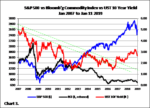
Liquidity continues to drive the markets. Fed intervention keeps a constant bid on bonds as liquidity seeps (flows) into the financial markets, collapsing bond yields, while lifting stocks and bonds. Each time bond yields bounce off the down trendlines reinforces the uptrend in stocks (Chart 3). Other major central banks contribute to the liquidity influx, including the Bank of England’s four rounds of QE (Mar 2009, Oct 2011, Feb 2012, Jul 2012) and near zero-interest rate policy and Bank of Japan’s negative-interest rate policy and QE program (since the election of Prime Minister Shinzo Abe in December 2012, and subsequent appointment of Haruhiko Kuroda as BOJ governor).
The Deflation-Inflation Battle
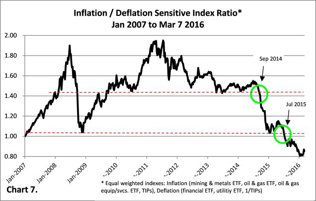
Deflationary and inflationary forces struggle for control of the U.S. economy. Following the 2001 Dot-com Bubble burst, deflationary effects dominate monetary inflationary counter-action. Increasing positive correlation between stocks and bond yields represents a tell-tale sign of deflationary conditions (red shaded regions of Chart 4). By early 2014, after five years of unconventional monetary policy, stock prices and bond yields start to diverge (stock and bond prices re-couple) suggesting a return to normalcy ahead. But, in mid-2016 investors start factoring in the possibility of a Trump administration and the specter of deflation is awaken. From H2 2017, stock prices and bond yields firmly track each other. Glancing at the right-side of Charts 1 and 4, the eight Fed rate hikes since 2017 starts to take effect in 2018 when stocks capitulate in Q4 2018 – S&P 500 down 12%, Nasdaq Composite down 15%, and Russell 2000 down 17% from August/September highs. Combined with long-term declining commodity prices (Chart 4) and an analysis of inflationary stocks vs deflationary stocks (Chart 5) suggests deflationary conditions are back.


Reading the Tea Leaves
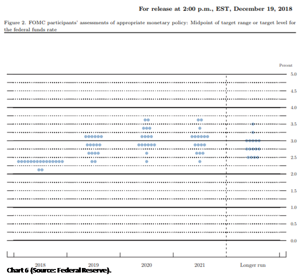
The Fed now expects only two rate hikes in 2019. At the recent FOMC meeting on Dec 18-19 the Fed revealed that it anticipates two rate hikes versus the three it expected back in Sept (Chart 6). The current target Fed funds rate stands at 2.25-2.50, yet Fed funds futures contracts indicate that the Fed is done with its hiking phase and the next move is likely to be a decrease (in 2021). So, what’s up?
Major Risks in 2019
The Mueller probe, more Trump investigations, Trump’s Wall, China trade spat, Brexit, Italian and European debt, China debt, U.S. debt, U.S. Syrian withdrawal, Nord Stream 2, U.S. government shutdown, Cloud-related snafu, slowing U.S. and global economic growth, the Oscars host, and the Kardashians all offer the potential to take one’s eyes off the ball. It’s still central banking liquidity that holds up the global economy and financial markets. Take that liquidity away and like a wrong move in Jenga…
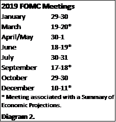
Leveraged loans and high yield debt pose a major risk. Outstanding issuance of triple-B rated bonds have grown from $700 BN in 2007 to $2.7 TRN today as lower-rated companies have relied on a low-interest rate environment for financing during an improving economy. But, announced bankruptcies of Toys R Us, Sears, David’s Bridal, Mattress Firm, Brookstone, Claire’s, and Nine West and GE credit rating downgrade to BBB+ (or three levels above junk) in 2018 and recent down grading of PG&E Corp to B/B2 indicates that the credit cycle is turning over. According to Bloomberg, nearly one-half (49.2%) of investment grade U.S. corporate bonds are rated BBB, up from 21% in 1988, 34% in 1998 and 36% in 2008. Unfortunately for these borrowers, any significant hiccup in expected cash flows now could trigger a covenant breach, or, perhaps, even a default (otherwise, they wouldn’t be rated BBB). And, what more for the high yield credits (BB, B, CCC, CC, C)? As the credit cycle rolls-over, once remaining credit lines are exhausted, access to new financing all but dries up for lower-rated credits, leaving DIP (debtor-in-possession) financing as the next likely recourse. While a detailed study will not be presented here, the search for yield has led many CLOs/CDOs to become filled with these high-yielding instruments and the leveraged loan market represents a risk to bank and other lending financial institutions loan portfolios. So, while many pundits have focused on the state of the equity markets, it’s the ginormous debt markets that should be scrutinized most. The upcoming Jan 29-30 FOMC meeting (and others to follow this year; Diagram 2) will be closely watched.
 As discussed ad nauseam, governments relied on loose monetary policies in the aftermath of the 2007-2008 Financial Crises to prop up financial markets as exorbitant debt levels curtailed fiscal remedies and fear of political blame prevented necessary structural changes. Like passing the baton in a relay race (or a game of hot potato), monetary bodies took turns implementing different brands of QE. In approximate order: Fed (QE1, QE2, Op Twist, ZIRP, QE3), BoE (asset purchases), BOJ (asset purchases, ZIRP, NIRP), SNB (asset purchases), ECB (asset purchases, ZIRP, NIRP). But, despite the influx of paper money, developed and many developing economies failed to rise from the mat leading to the next phase of the Financial Crises: currency wars.


You must be logged in to post a comment.